You found the lead.
Now what?
The profit calculation is done and it looks fine. That was never the hard part. The hard part is the question sitting underneath it — is this something that sells through, or something that sits?
The money comes back in weeks
You restock it, you redeploy the cash, and the same dollar buys again this quarter. The margin was real because it actually arrived.
The money is gone for a year
Not lost — worse, stuck. Paying storage, aging toward long-term fees, and unavailable for every good lead that turns up between now and then. On paper it is still profit. In practice you cannot spend it.
Velocity is how you tell those two apart before you pay, and this page is the five ways to measure it. Five, rather than one, because Amazon will hide, blank out or quietly corrupt any single signal — and you should never be stuck just because the obvious one is missing.
Finding the lead
Sourcing, and every lever that lowers your cost. That work sets your yield before you screen anything. Not part of this series.
Does it sell?
Whether there is real demand, how fast it moves, and therefore how many you should buy.
Will the price hold?
Whether it is still worth this much when your units land, weeks from now. Different signals, different traps.
Both, on real leads
The two checks run live against a real list, with the reasoning out loud.
Assume the lead landed in front of you this morning at a cost you have already driven as low as it will go. Nothing here is about where it came from — only about what to do with it now.
And nothing here is about profit. Every figure on this page answers one question only: is this thing selling, and how fast. Whether those sales happened at a price that works for you is a genuinely separate investigation, with different signals and its own failure modes — that is step three. Establish that it moves first; there is no point pricing something that doesn't.
Sell into demand. Don't try to create it.
Creating demand is a real business — it's what a brand does, with a marketing budget and years of patience. It is not our business. Our advantage as resellers is that we can move fast and buy opportunistically into demand that already exists, and that advantage only works if the demand is genuinely there before we spend. So the first job is never can I make this sell. It is is this already selling.
ROI on an unsold unit is zero
A million percent return on something that never sells isn't a deal. It's inventory. The money doesn't come back, so it never gets deployed into the next buy.
Velocity sets your depth
How fast it moves is what decides how many you buy. Get the rate wrong and you've either starved a winner or bought ten months of a slow item.
Your money only grows when it comes back
The same dollar turned over four times a year at 25% beats a dollar turned once at 60%. How often you can recycle your money is the real return — and sell-through speed is what sets it.
Which is why this is a screen and not a preference. An item that fails it doesn't cost you a smaller profit — it costs you the use of the money for as long as it sits, and that is the expensive part.
The lead is not the asset. The demand underneath it is.
Five signals, each one covering the last one's blind spot
There is no single number that tells you whether an item sells. There are five, arranged roughly best-to-worst, and the reason you learn all of them is that each one fails in a way the next one is immune to. You climb down the ladder only as far as you need to.
None of them are velocity questions, and every one is faster to check than anything below. Clear them first, or you can do perfect work on an item you were never able to sell in the first place.
| Ungated for your account | Check per brand, per category, before the first buy on a new ASIN |
| Actually the same item | Packaging, size, count, bundle. A two-pack against a single unit is a different product |
| In stock and buyable | At the price the lead claims, in the quantity you want |
| Sellable the way you intend to ship it | Being ungated is not the same as being ungated for FBA. You can be approved on a listing and still only be permitted to sell it merchant-fulfilled — and you find out after your units have arrived at a warehouse, where they sit stranded. If no FBA seller appears anywhere in the historical offers, treat that as the warning it is and find out why before you ship |
| Hazmat, bundles and multi-packs | Hazmat review can hold a shipment for weeks or block FBA outright. A bundle or multi-pack is its own listing with its own rules — confirm the pack size on the listing matches the pack size you are buying, in both directions |
Units bought — the badge
Strongest

One line of text is the entire difference between those two listings — and it is the fork in the road for this whole page. Same product, same rating count, same everything else. The one on the left has just told you what you needed to know. The one on the right has told you nothing, and every rung below exists because of it.
The best signal available, because it isn't an inference — Amazon is telling you directly how many sold. Everything else on this page is a proxy for this one. When it's present, use it and stop climbing.
It comes as a bracket, not a number. 100 means somewhere in 100–199. Take the low end so you're underwriting the pessimistic case, divide by 30 for a daily rate, then divide again by the sellers sharing the buy box — because that flow is split, and only your share pays you.
Treat it as a trailing 30 days, but hold it loosely: it appears to roll rather than snap to a calendar month, and Amazon publishes neither the cut-off nor how recent sales are weighted. Good for order of magnitude, not for arithmetic to two decimal places.
50+ bought confirms it sells
Velocity established, and you can stop climbing the ladder. That is genuinely the whole job of this rung.
At what price were those sales?
Very often a majority of them happened at a price that isn't profitable for you. A confirmed 50 units a month tells you demand is real; it says nothing about whether the demand was at your number. That is Part 2, and it is why these are two screens rather than one.
What the bucket is worth to you
The working target is nearer 45 days of cover, so a replenishment wave lands about when you stock out. The 30-day figure here is the easier one to feel.
It's frequently just blank — and a blank is not a zero. The badge only appears once an item clears 50 units in the month. Below that, Amazon shows nothing at all, so every listing selling 0 to 49 units a month looks identical from the outside.
That range is where the problem lives. An item doing 49 a month is a perfectly good buy. An item doing 0 has never sold and never will. The badge cannot tell you which one you are looking at, and it is silent on both. That is the entire reason the rest of this ladder exists.
Worth internalising: the badge answers "is this a high-volume item?" It does not answer "does this sell?" Those are different questions, and only the second one is a go/no-go.
And a blank is itself a soft signal — Amazon shows this figure because it helps them sell. When it isn't showing, that absence is telling you something, even though it isn't telling you a number.
Sales rank
Direction, not rateSales rank is Amazon's ordering of every product in a category by how much it sells. The best-selling item in the category is #1. The second best is #2. An item ranked 9,500 has 9,499 things in its category outselling it.
So the number is a position in a line, and the line is sorted best-first. Which gives you the only relationship you need to hold on to: the further an item sits from #1, the less it is selling. The closer it moves toward #1, the more it is selling.
That reads backwards the first few times, because the good direction is downward — and it is the single most common thing people get inverted.
Because it's a position rather than a rate, one rank reading on its own is nearly useless. Rank 9,500 in one category is a different business from rank 9,500 in another. What you actually read is the direction it has moved, and that lives in three buckets:
Read the axis carefully — the rank number runs upward, so #1 sits at the bottom. A line falling toward the bottom is the item moving closer to #1, which means more of the category is now behind it. Falling line, improving item.
And read the sustain, not the spike. A rank that dives for two days and returns tells you a sale happened, not that the item is strong.
Plenty of listings have no sales rank at all, and it does not mean what people assume. Three separate causes, only one of which is "it never sold":
- It genuinely has never sold.
- It's a variation that got detached from its parent — the rank craters or vanishes as an artifact of the catalog, not of demand.
- Amazon has simply switched it off for that listing.
In two of those three, the item can be selling perfectly well. A missing rank is a missing instrument, not a verdict.
Offer count
Supply, and a price forecastWhen rank is gone, the number of sellers on the listing still moves, and it still tells you something. Same three buckets — increasing, flat, decreasing — but here they're reporting on supply, which makes this the one rung that also forecasts price.
A sale happened and inventory is arriving
Sellers found the same discount you did and their units are checking in. Too much supply chasing the same demand — classical economics does the rest, and the price comes down. The faster the climb, the harder the landing.
Supply is thinning against steady demand
Sellers are stocking out and not being replaced. Less supply, same demand, and the price rises. This is the condition you want to be buying into, and it's the one everyone else has already skipped past.
Both are Keepa charts, and both are two stacked panels sharing one timeline along the bottom. The window in each is roughly three months, mid-December through early March.
- Top panel — price and rank together. Dollars on the left axis, sales rank on the right. Several things are plotted at once, and Keepa colours them consistently: green is the sales rank, pink is the Buy Box price, blue is the lowest New offer, orange is Amazon selling directly, and a faint grey dashed line is list price. Keepa prints this legend down the right-hand side of the real chart — check it there, because which series are shown is a setting and yours may differ.
- Bottom panel — the offer count. This is the one that matters on this rung: the blue line is simply how many sellers are on the listing, against the scale on the right. Nothing else is plotted in that panel.
So read the bottom panel for the seller count, then glance up at the top panel to see what the price did while that was happening. The whole argument of this rung lives in the relationship between those two panels — not in either one alone.
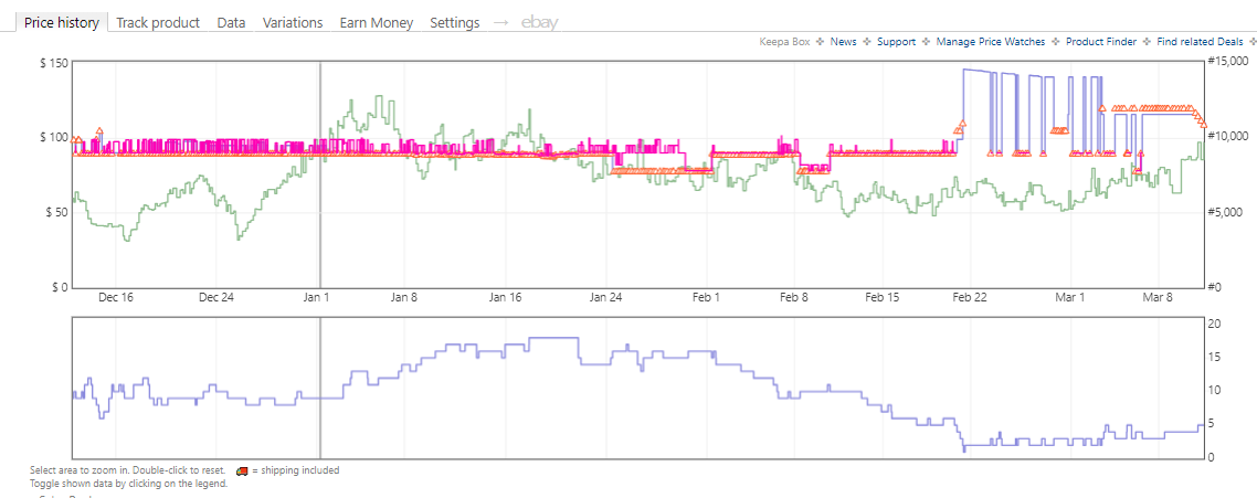
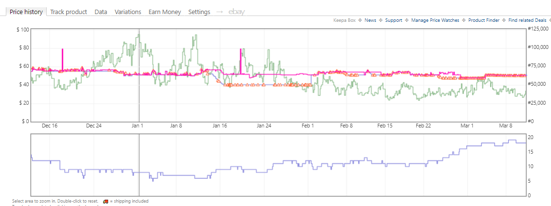
Both are real listings. Read the two panels together, always — the seller count alone tells you supply moved; the seller count next to the price tells you what it did to your margin. A steady, flat offer count needs no illustration: it means the field is stable and whatever the price is doing, competition is not the cause.
The catch is that you can't see where you are in that cycle. A rising offer count doesn't tell you whether 10% of the incoming inventory has landed or 100% of it. You're reading a wave mid-break, and the day you look is arbitrary.
The offer count only moves when a seller enters or exits the listing. It is not a sales counter, it's a seller counter. Watch what that actually costs you:
Three units sold and the graph is flat. The seller is still on the listing, so nothing about the count changed.
That is only half the problem. Put the two halves together and the signal is unreliable in both directions at once — there are sales it cannot show you, and there is movement it shows you that was never a sale.
The count sat still while units moved
Any sale that isn't a seller's last one. Ten units down to one is invisible; only one down to zero registers.
A seller who never stocks out is permanently invisible. Hold deep enough inventory and not one of your sales ever touches this number.
The count moved and nobody bought anything
Fulfilment-centre transfers. Amazon moves stock internally and it can flash out and back in. That is logistics wearing the costume of a sell-through.
Merchant-fulfilled sellers toggling. They manage their own quantity, so they drop off and reappear for reasons that have nothing to do with a customer — including listing inventory they never physically had, then pulling out together when a sale ends.
Suspensions and enforcement. A seller gets actioned and their inventory is pulled. Offers fall, and not one unit was bought.
Lost inventory reinstated. Amazon finds stock it had written off and puts it back, often without the seller doing anything. Offers tick up out of nowhere.
You don't need to identify which one you're looking at. That's the useful conclusion, and it's why this rung sits third rather than first: the offer count reports sellers, and sellers come and go for a dozen administrative reasons that have nothing to do with demand. Treat every move as a question, never as an answer — then go and settle it on a rung that counts units instead of counting people.
Rating count, and how fast it grows
A pulse, not a measurementThis is the loosest signal on the ladder and it sits here deliberately — it is what you reach for when the rungs above have all gone quiet. It will not give you a number you can size an order from. What it gives you is a heartbeat.
The reason it works at all is almost too simple to state: you cannot leave a rating on something you did not buy. So every new rating is a purchase that definitely happened. If the count is still climbing, there is still activity on that listing — and when nothing else will confirm that for you, that is genuinely worth something.
Only a small slice of buyers ever bother, call it 1–3%, so the arithmetic inverts roughly: a hundred orders leaves about one review behind. Treat that as an order-of-magnitude sense of scale, nothing tighter.
The review rate is an assumption — move it and the answer moves a lot. This is a rough sense of scale, not a measurement.
Dividing a lifetime total by the age of the listing assumes the sales were spread evenly across that life. They very often weren't. A five-year-old listing can have done all of its business in year one and sat idle ever since — and it will show you exactly the same rating count as one selling steadily throughout.
Averaging across that gap invents a number for years two through five where nothing happened at all. So this rung tells you demand existed at some point. It cannot tell you when, whether it is seasonal, or whether any of it is still true this month.
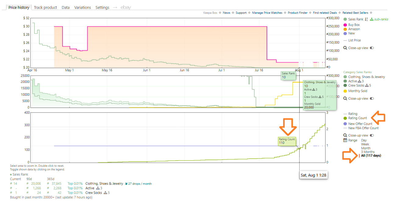
| Date | Monthly sold | Rating count | Ratings added | Implied review rate |
|---|---|---|---|---|
| Jul 17 | 500 | 35 | — | — |
| Jul 22 | 2,000 | 43 | +8 | 3.84% |
| Jul 25 | 10,000 | 55 | +12 | 2.00% |
| Jul 29 | 20,000 | 83 | +28 | 1.40% |
| Aug 1 | 20,000+ | 110 | +27 | 1.35% |
Implied rate = ratings added ÷ units estimated from the monthly figure over the elapsed days. It settles around 1.35–1.4% once volume is high enough for the estimate to mean anything — comfortably inside the 1–3% assumption. The 3.84% at the top is the badge's coarse buckets at low volume, not a real difference.
Is anything happening at all?
A count that keeps climbing is proof of ongoing purchases, because a rating requires one. When there is no badge, no rank and nothing in the offer count, this is the last confirmation available that the listing is alive.
The slope carries it — ratings added recently against ratings added a year ago. That is a direction, and a direction is what you actually want.
Working out how many it sells
The two numbers above describe different things: 110 is a lifetime total that has been accumulating for 117 days, and 20,000 is a snapshot of one trailing month. They were never going to reconcile, and the gap is the lag, not an error.
Which is the practical rule: a young listing that is taking off will always look understated here. Don't size a purchase from a rating count.
The marginal rate in the table — settling near 1.35–1.4% — is the interesting part, because it says the 1–3% rule of thumb is about right when you have enough volume to measure it against. That is a decent sanity check. It is still not a substitute for counting.
Variations need one extra step. A parent listing's reviews are the sum of all its children, so a size or colourway holding 40% of the reviews is doing roughly 40% of the sales. Software that reports velocity at the parent level will otherwise hand you a number several times too large for the specific variant you're buying.
Worth checking whether you still need this — Amazon now appears to report units bought per child listing, which would make the split redundant where the badge is present. Verify on the listing in front of you rather than assuming either way.
It is cumulative and it lags, so the level is close to meaningless on its own. Reviews arrive weeks after the orders that produced them, so a listing accelerating right now reads as quiet. And in the other direction, an old listing can carry four thousand ratings earned over six years and be selling nothing at all today.
So the number tells you the item has been in demand at some point across its life — and genuinely nothing about when. All of it could have happened in the listing's first year. Only the slope tells you whether any of it is still happening.
It also cannot tell you anything about price. A rating confirms a purchase happened; it says nothing whatsoever about what was paid. An item can be reviewed enthusiastically all the way down a price collapse.
Reach for this rung last, and treat what it gives you as a yes/no on whether the listing is alive — then size the buy from something that counts units.
Stock history
The gold standardUnderneath the graph is the thing the graph was drawn from: a series of stock levels with timestamps, per seller. Every step down is inventory leaving. Add up the step-downs and you have units sold — an actual count, not an inference from a rank or a bracket or a review rate.
This is the only rung that answers the question directly. It is also the most work, which is why it sits at the bottom rather than the top.
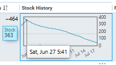
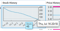
- Open the product in Keepa and go to the Data → Offers tab.
- Enable Include Historical Offers — this is the step people skip, and skipping it quietly ruins the answer. See the note below.
- Filter to FBA and Only New, and set the window to 180 days.
- Read down one seller's stock column and mark every point where the number falls. Ignore rises — those are restocks.
- Ignore jumps to suspiciously round numbers. A level landing on exactly 1000 is a display ceiling, not a real position.
- Repeat across several sellers — see below for why this step is the one that makes the whole thing trustworthy.
- Add the falls together and divide by the months in the window. Compare against the badge bracket if there is one; if they disagree wildly, trust the count.
By default you are shown the sellers who are on the listing right now. But you are trying to measure a period of time, and over any real period sellers arrive and leave. The ones who sold through their stock and exited are exactly the ones whose sales you most want to count — and by default they are simply not in the data.
Leave it off and you get a confident-looking answer built on whoever happens to be standing there today. Turning it on is what converts a snapshot of the listing into a history of it, which is the only thing you can count sales from.
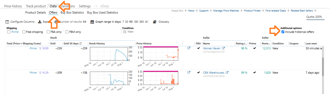
Ten minutes the first time, two minutes once it's familiar. Worth it on anything you're buying deep — shallow buys don't earn the time.
So this is the method — and here is the noise you are counting through. A stock series records inventory changing. Inventory changes for plenty of reasons, and only one of them is a customer buying something:
| Why the number moved | What actually happened |
|---|---|
| Inventory moved, not sold | Transfers between Amazon's own fulfilment centres, bulk removals, or the seller pulling stock back out |
| The seller typed it in | Merchant-fulfilled quantities are self-reported. A seller can list stock they do not physically hold, and change the number whenever they like |
| The listing switched off and on | Delisting and relisting, a supplier feed refreshing, or a temporary suppression |
| Enforcement | A seller suspended or actioned, and their inventory pulled from the listing without a single unit being bought |
| Amazon's own bookkeeping | Lost inventory found and reinstated, placeholder values where the real number is unknown, or a display capped by the seller's purchase limit |
| Plainly bad data | Values that are simply wrong, missing, or stale — every data feed has some |
Each of those shows up on the graph as one of six shapes. Learn the six by sight and most of the false volume disappears. Every example below is real data from a real listing:
Dramatic drop — the cliff
30 → 5 in a week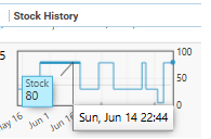
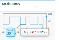
A drop of 80% or more, all at once, from a base big enough to matter. Read naively that is twenty-five sales in a few days.
The tell: retail demand does not arrive in one lump. This is a bulk removal, a transfer between warehouses, or the seller pulling stock — and it is the single largest source of fake volume there is.
Oscillation — the bounce
1, 134, 1, 134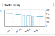
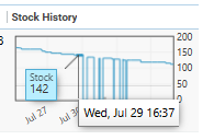
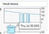
The level slams between two far-apart numbers and back again, twice, inside two days. Counted naively that is well over two hundred sales.
The tell: 133 units cannot sell and be fully replaced twice in forty-eight hours. This is one seller's feed switching on and off — and on this listing three separate sellers were doing it at once.
Reversal — the V
399, 1, 397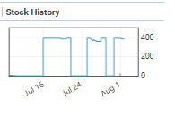
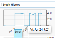
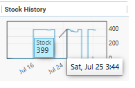
Stock collapses almost to nothing and returns to within a whisker of where it started, two days later.
The tell: sales do not un-sell. 398 units did not leave and 396 did not arrive over a weekend — and the recovery landing at almost exactly the starting number is the giveaway.
Zero-out — the sell-out that refills
56, 0, 60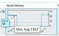
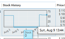
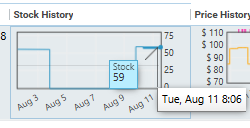
Stock hits zero, then comes back within days to roughly the level it left. It reads as a complete sell-through followed by a restock.
The tell: a genuine sell-out rarely refills that fast, and almost never that precisely. This is going out of stock on paper — a listing switching off and back on.
The 999 issue — the placeholder
999 sitting beside 499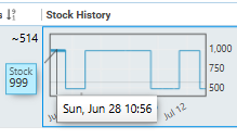
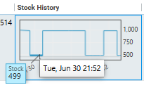
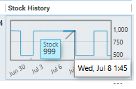
The number 999 or 1000 appearing in the series. It is not a quantity at all — it is what gets recorded when the real level is unknown or capped.
The tell: look at the scale. A move from 999 down to 499 reads as five hundred sales, and none of them happened. Any transition touching this value is meaningless.
Spike — the leap
27 → 562 → 13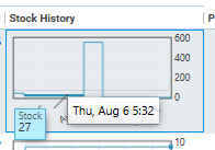
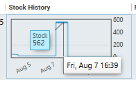
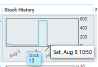
The level jumps by hundreds and immediately falls back. Frequently this is a placeholder sitting next to a real number.
The tell: no warehouse gains 535 units and loses 549 in a day. Count the down-leg and you have invented hundreds of units in a single stroke.
None of this is exotic — it is ordinary behaviour of the data. And it is not a third-party-seller problem: several of these fire on Amazon's own stock series. Note also how many of the worst offenders are merchant-fulfilled, where the seller types the quantity in themselves.
The last one is different, because it is not about a single series at all.
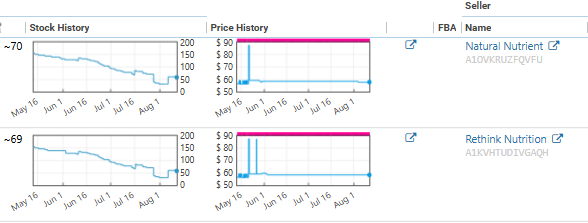
This is why reading several sellers is not just about sample size. Sellers who move in genuine independence corroborate each other. Sellers who move in lockstep are one seller wearing several names, and the agreement you were treating as confirmation is the opposite.
And every bit of it can be undone by one setting.
A purchase cap makes most of the sales invisible. If a seller sets a maximum purchasable quantity, the visible stock level is clamped to that cap. Drawn as the stock chart you would actually be looking at — drag the cap and watch how much of the sell-through vanishes underneath it:
Two lines, both tracking the same 20 units as they sell — what is really on the shelf, and what the stock history lets you see. Drawn as a stair-step rather than a slope, because that is how the real data plots: the level holds flat between sales and drops on each one.
While more than 7 units remain, the displayed stock level is pinned at 7 and simply refills behind it. Only the final 7 ever move the number.
Three more ways to misread it:
- Merchant-fulfilled quantities are self-reported. Amazon takes the seller's word for the number, so their series is a claim rather than evidence.
- A sudden jump down and back up is usually not sales. Inventory moving between Amazon's own fulfilment centres shows up as movement in the series. Gradual, stepped decreases are sales; abrupt cliffs that recover are logistics.
- Weight recent movement more heavily. If you pull 90 days and every step-down sits in the 70–90-day band with nothing since, that isn't a slow seller — that's an item whose season has already ended. The ideal item shows sustained movement across the whole window, not a burst at one end of it.
When in doubt, get more witnesses. That is the whole defence, and it is why the honest example at the top of this section shows three sellers rather than one. A single ambiguous series is a coin toss; three independent series that agree is a finding. The counter to all of the above is volume of witnesses — with one qualification. Read several sellers, not one. Genuinely independent sellers are not coordinating, so if one is running a cap or showing an artefact, the others aren't doing the same thing on the same days. Agreement across independent sellers is the closest thing to proof this data offers. Agreement across synchronised ones is the thing you just learned to spot.
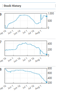
No single signal survives on its own
Which is the actual method: not picking the right metric, but knowing what each one is blind to and reaching for the one that isn't. Here is the whole ladder on one screen.
| Signal | What it proves | Where it lies | What covers it |
|---|---|---|---|
| Units bought the badge | Actual sales, stated by Amazon | Blank under 50/month — so 0 and 49 look identical. Rolling window, undisclosed weighting | Everything below |
| Sales rank | Where it sits in its category — the closer to #1, the more it sells. Direction over time is the signal, not the number | Absent when detached from a parent or switched off — neither means "doesn't sell" | Offer count |
| Offer count | Supply pressure, and therefore where price is heading | Only moves on entry/exit. Invisible for deep sellers. Fakeable by merchant-fulfilled listings | Stock history, across sellers |
| Rating count | That real demand existed at some point | Lifetime total — says nothing about today | Rate of increase; the badge |
| Stock history step-downs | Units sold, counted directly | Purchase caps hide everything above the cap; merchant-fulfilled numbers are self-reported | Reading many sellers at once |
Read down the third column and the design of the ladder becomes obvious: no two signals fail for the same reason. That's what makes a stack of imperfect measurements add up to a decision.
Velocity decides depth, not just yes or no
The screen isn't only a gate. Once you have a rate, it sets the size of the order — which is where most of the money is actually won or lost.
Weaker rank, fewer units. Stronger rank, more.
The quantity you buy follows the rate you measured, not how good the margin looks. A 60% ROI on something that moves twice a month is still a three-unit buy.
Thirty a month is one a day — and slow is not the same as bad
Convert the rate into something you can feel before you decide anything. Thirty units a month across the whole listing is one unit a day; split between four sellers it is one unit every four days for you. Anything slower than that, you need to account for deliberately rather than discover later.
A slow seller can still be a perfectly good buy. The rule is simply that the longer your money stays tied up in it, the more return you should demand for the wait — and the lever you pull is quantity, not price. Buy fewer of it. A slow item bought three deep is patience; the same item bought thirty deep is a decision you will be living with for a year.
Total sales across all sellers is what the listing can absorb
If the listing moved 50 units over 90 days, that is the demonstrated capacity of the whole listing — not your share of it. The buy box rotates, so your realistic take is that ceiling divided among the sellers on it. Buying past the ceiling doesn't create demand; it just means you're the one still holding units when everyone else has sold through.
Now you know it sells. You still don't know what it sells for.
Everything above establishes that the demand is real and gives you a rate to size against. It says nothing about the price that demand transacts at — and an item can move a thousand units a month and still lose you money, if the thousand sold at a price you never underwrote. Notice that rung 03 already started pointing at this: supply pressure was forecasting price, not sales. That's Part 2.
You're not buying the product. You're buying the data.
Which is the whole of it. The item is a vehicle; what you are actually paying for is a claim that it moves. Every one of the five signals above exists to test that claim before the money leaves — and the buys you don't make because of them will quietly do more for your returns than most of the ones you do.
Print this part
Everything above, as a checklist you can keep next to you while you screen. Six questions, in order, and you stop at the first one that answers cleanly.
First, four things that make the rest pointless: are you ungated · is it genuinely the same item · is it in stock at that price · is it FBA-eligible. Any “no” and stop here.
- Does it show a “bought in past month” figure?
Yes → velocity confirmed, stop climbing. Take the low end of the bracket, ÷30 for a daily rate, ÷ the sellers sharing the buy box for your share. Then go straight to Part 2 — you still don't know what price those sales happened at.
No → it sells 0–49 a month. That range holds both “fine buy” and “never sold.” Keep going. - Which way has the sales rank moved? It is a position, not a score. #1 is the best seller in the category, and the further from #1, the less it is selling — so a falling number means it is moving toward #1 and improving. Read months, not days: a two-day dive is a sale, not strength. No rank at all doesn't mean no sales — it can be detached from a parent or switched off.
- Which way is the offer count moving? Falling = supply thinning, price firms — the good one. Rising fast = everyone found the same deal, price is coming down. You cannot tell where you are in that cycle, so treat it as an expectation, not proof. It only moves when a seller joins or leaves, so most sales are invisible to it.
- Is the rating count still climbing? The last pulse check, for when everything above is silent. You can't review what you didn't buy, so a count that keeps rising proves sales are still happening. Use the slope, never the total — reviews arrive late, so a young listing that's taking off always looks quiet. Don't size a buy from it. On a variation, a child holding 40% of the reviews is doing about 40% of the sales.
- Do the step-downs in stock history agree? Data → Offers → Include Historical Offers → FBA → Only New → 180 days. You want a steady stair-step down. Discount the rest: cliffs (bulk removals), bounces that return to the same number, dips that recover within a week, sell-outs that instantly refill, anything reading 999, and leaps of hundreds. Read several sellers — but if two of them trace the same curve, that is one supplier feed, not two witnesses.
- How many should you buy? Convert the rate into something you can feel: 30 a month across the listing is one unit a day, and split between four sellers that is one every four days for you. Total sales across all sellers is the ceiling; your share is that divided by the sellers on it. Weaker rank → fewer units. A slow item can still be a good buy — just demand more return for the wait, and take it in less quantity.